REDESIGN
ONLINE VAPE-SHOP
ONLINE VAPE-SHOP
Full redesign of the e-commerce experience to improve usability, educate new users, and boost conversions.
PROJECT
The shop A&L is capable of providing everything needed to vaping in the best conditions possible.
MY ROLES
I have been working on this project since 2017 until today. And I was the only designer most of the time.
GOALS
1. Involving people in quitting smoking using e-cigarettes.
2. Increasing sales of electronic cigarettes and e-liquids.
2. Increasing sales of electronic cigarettes and e-liquids.
SOLUTIONS
1. The new version of the site includes a blog and a guide to provide essential information about e-cigarettes
and DIY e-liquids.
2. Product pages have been enhanced to help people make informed choices. These pages now include video tutorials, calculation modules, 360-degree product demonstrations, and an FAQ module.
and DIY e-liquids.
2. Product pages have been enhanced to help people make informed choices. These pages now include video tutorials, calculation modules, 360-degree product demonstrations, and an FAQ module.
BACKGROUND
The A&L team and I are convinced that vaping is the best way to quit smoking.
USER PERSONAS
INSIGHTS:
1.
A beginner and a casual vaper very rarely read technical information
2.
Users often come to the site to use the DIY calculator
3.
Saving is the main reason in most cases for converting to vaping
4.
Over 70% of users start a session by viewing the discount page
HOME
I wanted to show choice of flavors and redirect the user flow inside the product list.
MAIN NAVIGATION
BEFORE
Main pain point: the two menu blocks are separated by a logo and images.
AFTER V1
After extensive testing, it was discovered that the central placement of the logo and images disrupted smooth navigation
AFTER V2
I grouped the navigation in an order familiar to the user.
I allocated more space to the search form and consolidated the product navigation menu into a single line
I allocated more space to the search form and consolidated the product navigation menu into a single line
Mobile Home Page
Due to the increase in mobile traffic,
it became necessary to optimize the mobile version of the site’s main page.
it became necessary to optimize the mobile version of the site’s main page.
PRODUCTS LIST
FILTERS
QUICK BUY
QUICK BUY ON MOBILE
After internal testing, we found that horizontal versions of the product card were the most convenient for selecting a product type.
product page
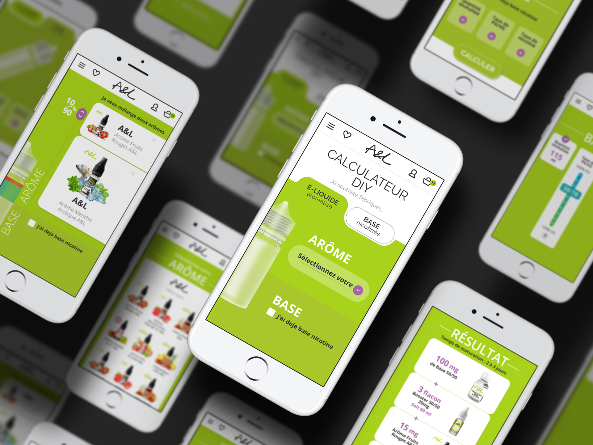
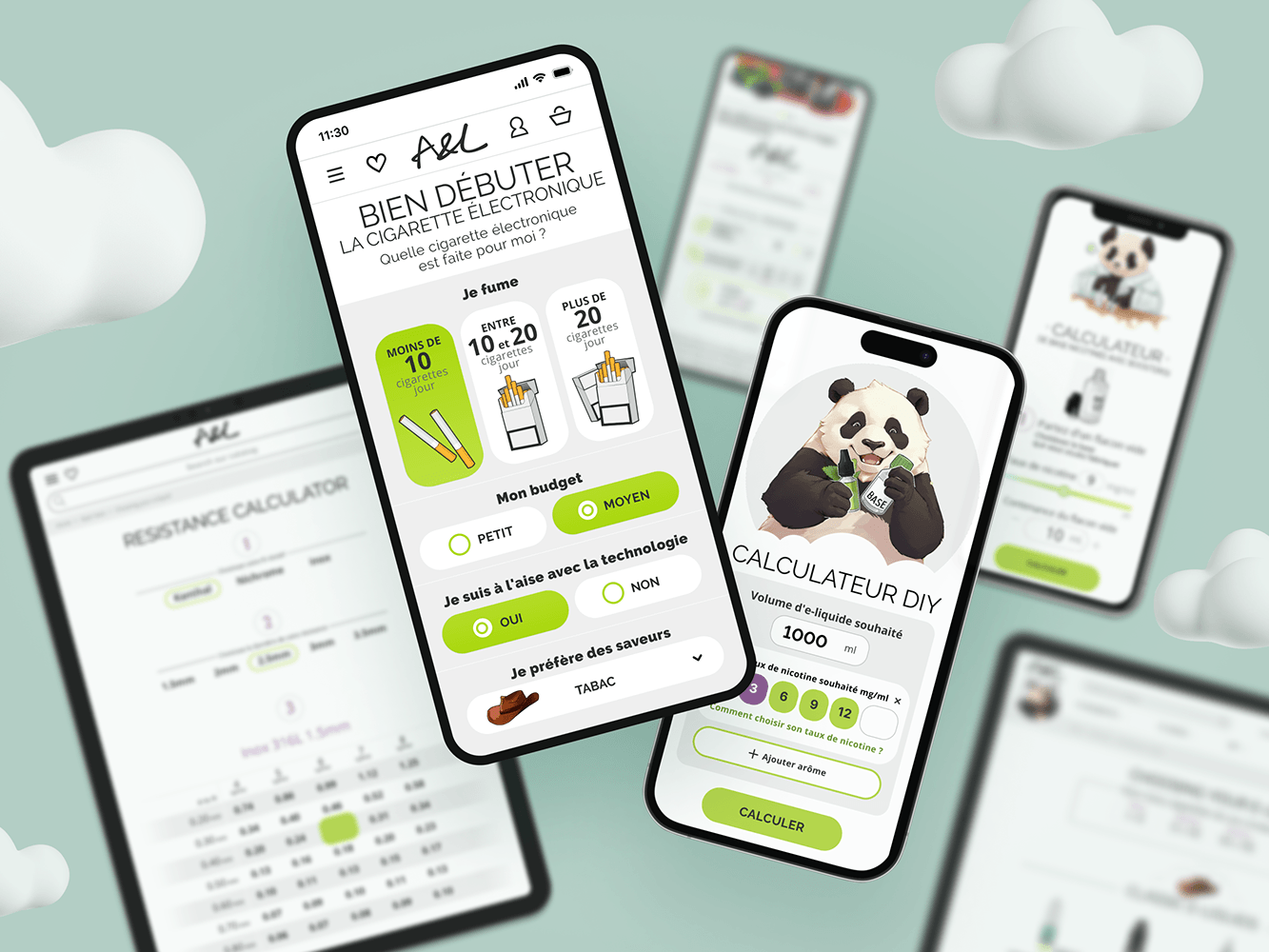
QUICK CALCULATION
For users who are already familiar with several products (for example boosters, bases and flavors) a short confirmation is required to activate their purchase.
To make the experience smoother, I suggested pre-filling the calculator form with the most popular data (for example, 10 ml and 50/50 pg/vg)
CROSS SELLING
Very often users need some consumables when purchasing. So I decided to set up cross selling in order confirmation popup
CHECKOUT PROCESS
INSIGHT
Users often add items to cart on their mobile phone and complete their order on computer.
I decided it was necessary to optimize the mobile version of the checkout process. Some changes also affected the desktop version, such as the stages of placing an order and selecting a gift to show progress.
purchase history
Purchase history is among the top 5 most popular pages on the site. The primary question users have when they visit is, "Where is my order?"
To address this clearly, I am creating an interactive historical trail.
To address this clearly, I am creating an interactive historical trail.
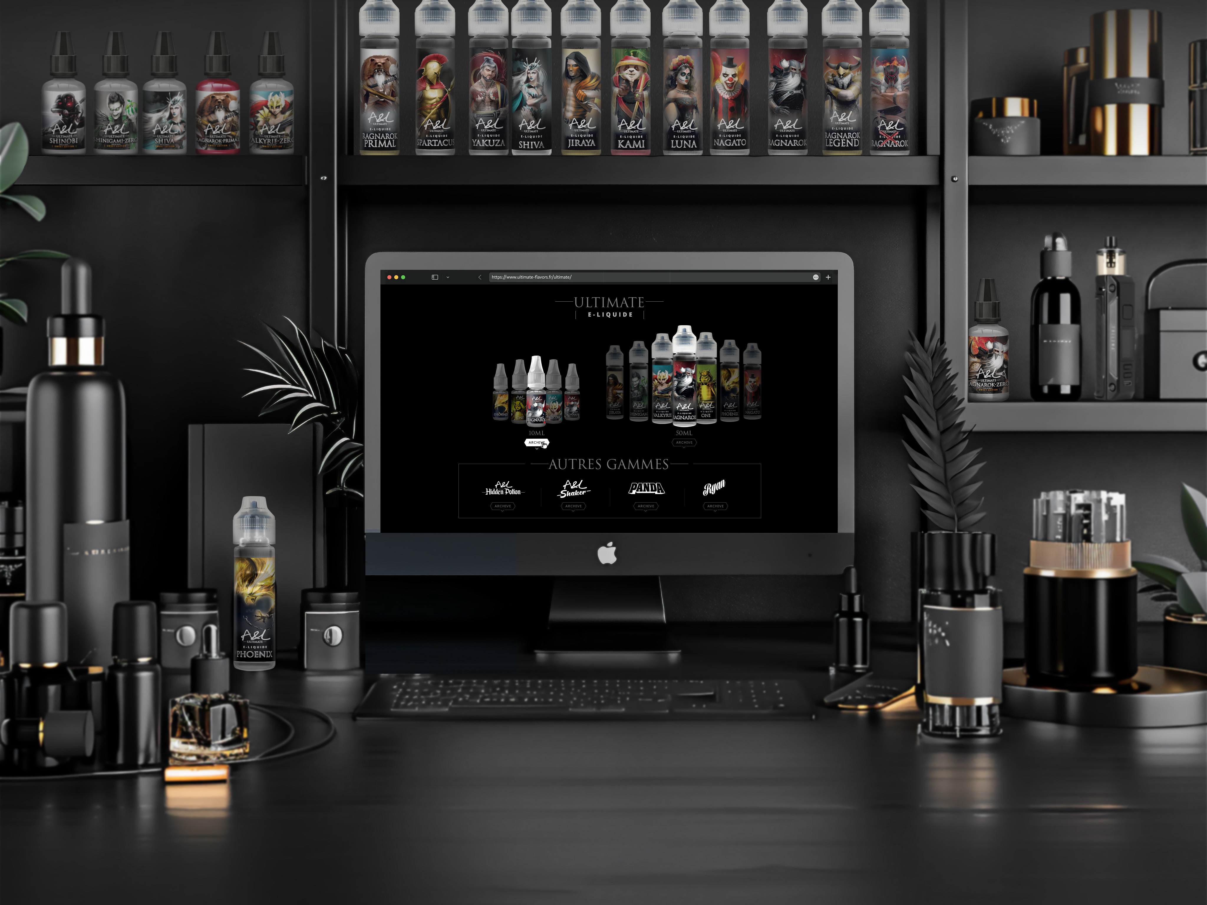
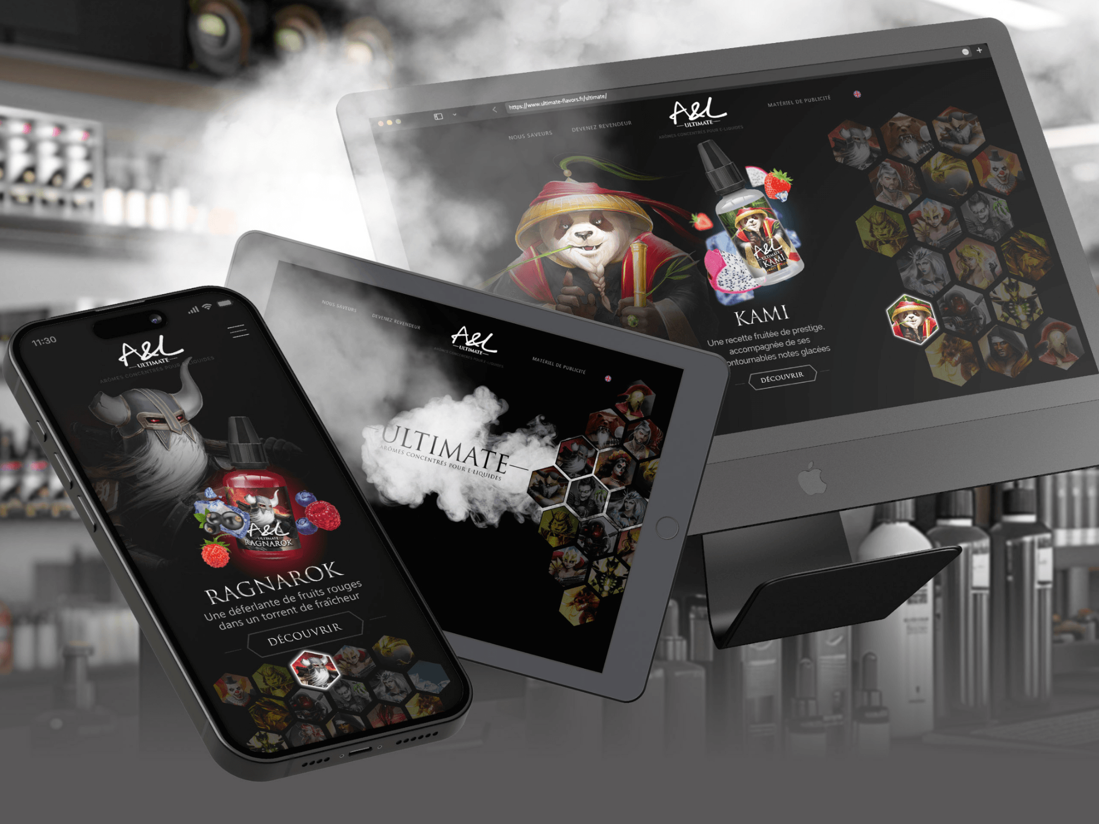
A&L BRANDS
>35% income
comes from the sales of
comes from the sales of
A&L flavor lines
After the launch of
the promotional page in 2022,
A&L Brands sales volumes
increased by >20%
GUIDE
A&L sells a product that requires additional information support. The launch of the guide sectoin incerased organic traffic by >20%, and it increased the number of new users by >10% and it reduced the workload of the aftersales support center.
DIY E-LIQUID RECIPES
A&L has been building its expertise in the field of DIY since the creation of the company. The website has a special section where successful recipes from our clients are collected.
BLOG
The blog promotes deeper engagement with vaping enthusiasts and enhances our company's reputation as an industry expert.
other pages
Since 2017, I have been working on the A&L website, creating diverse pages to meet various needs. These pages are continuously updated to enhance site performance.
ICONOGRAPHY
In the end, I managed to convince the directors that raster icons were outdated and not practical. I proposed a series of vector icons that display well on all devices
REJECTED ICON CONCEPTS
I went through several iterations of different styles before I reached the final version of the icons.
During this time, I realized how important it is to prepare detailed reference research
OUTCOME
The number of regular customers increased 4 times over the period from 2017 to 2023
The annual turnover of the company has grown
from 7M in 2017 to > 21M in 2023
2/3 come from the website
2/3 come from the website
IMPACT
A&L has become a DIY specialist, supported by the trust of
over 80K followers
In 2024 the company plans to move to new warehouses whose area is > 2 times larger
WHAT I LEARNED
01
TO BE EMPATHETIC
Design should be based on user research, not on assumptions about users.
02
BE A VERSATILE DESIGNER
I have played various roles requiring design creativity: Product Designer, Researcher, Data Analyst, UX/UI Designer, Art Director, Illustrator, etc.
03
TO BE PROACTIVE
I have to cultivate myself a culture of focusing on user needs in the company.
REFLECTIONS
01
Design influences
the world
the world
Design should be based on user research, not on assumptions about users.
02
PRIORITY SETTING AND FLEXIBILITY
I have to tackle the most relevant business problems and users’ needs to
define a target metric to work towards. And at the same time, to change
directions at any time.
03
LIFELONG LEARNING
Despite over 17 years of experience in design, I continually feel like a beginner, regularly discovering new and fascinating aspects of the field.
